Beyond Flat Design: The Rise of Neumorphism 2.0 & Glassmorphism
- Kumar Gourav
- Jul 4, 2025
- 2 min read


Introduction
For years, flat design dominated the digital world—clean lines, bold colors, and minimal shadows. While it improved readability and performance, many began to feel it lacked depth and delight. Now, in 2025, designers are shifting toward more tactile, layered, and immersive aesthetics like Neumorphism 2.0 and Glassmorphism.
What Is Neumorphism 2.0?
Neumorphism (or “soft UI”) initially emerged in 2020. It combined soft shadows, highlights, and subtle gradients to mimic extruded plastic or rubber-like surfaces. While beautiful, early versions suffered from accessibility issues due to low contrast.
Neumorphism 2.0 fixes that. It introduces:
Higher contrast for better legibility
Bolder colors with softer depth cues
More functional, interactive components
Accessibility-first focus with adjustable shadows
Today, it’s used primarily in dashboards, health & fitness apps, and IoT interfaces where tactile visuals enhance engagement.
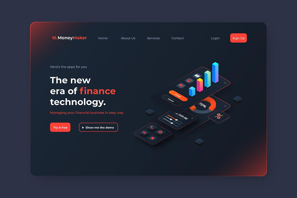
What Is Glassmorphism?
Inspired by frosted glass panels, Glassmorphism features:
Background blur effects
Semi-transparent elements
Vivid backgrounds (often gradients or wallpapers)
Floating, layered card layouts
Popularized by macOS Big Sur and adopted in Web3 and fintech platforms, Glassmorphism is perfect for interfaces where depth, layering, and hierarchy are key.
Key Differences Between the Two
Feature | Neumorphism 2.0 | Glassmorphism |
Aesthetic | Soft, tactile surfaces | Transparent, frosted glass |
Usability Focus | Tactile interaction | Visual layering & depth |
Use Cases | Dashboards, wearables | Crypto, fintech, apps |
Background Style | Light & dark neutrals | Bright gradients/images |
Why They’re Trending Now
✅ Users crave more realism and visual depth in digital products.✅ Modern CSS and WebGL capabilities support these effects efficiently.✅ Brands want differentiation without sacrificing usability.✅ It creates a sense of luxury and modernity, especially in AI, health tech, and creative tools.
When (and When Not) to Use
Use if:✔ Your app needs to feel tactile or futuristic✔ You’re targeting younger or design-forward users✔ Accessibility is not compromised
Avoid if:✘ You’re designing for heavy data entry or form-first UI✘ You want super-lightweight, fast-loading UIs✘ Your audience includes visually impaired users (without alt themes)
Conclusion
Flat design taught us simplicity, but the future demands depth. Neumorphism 2.0 and Glassmorphism combine beauty with function—inviting users to touch, explore, and immerse.
As a designer, choosing the right visual trend isn’t about being trendy—it’s about enhancing experience while keeping accessibility, brand, and context in mind.


Comments